There
are mainly two different types of statistical results you can visualize
using EMEGS: cell means of a single ANOVA and continuous results in
form of SCADS files.
Continuous results
in SCADS files: Visualizing results
of continuous analysis works pretty much like creating 3d plots of
scalp potentials or magnetic fields or other continuous signals.
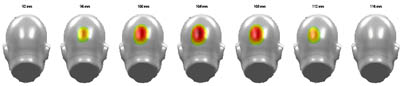
However, for files containing p-Values, EMEGS offers a special coloring
that reminds of significance color coding used in fMRI research:
reddish colours stand for a significant positive difference, blueish
colours code a significant negative difference. However, this only
applies to t-statistics, the test parameter of which still contain
directional information. ANOVA-results are F-statistics and do not
contain directional information. Therefore, p-value-files generated by
the ANOVA module contain only positive p-values and therefore will
always be in reddish colours. To activate statistical colouring, click
the 'Stats' button on the emegs3d-menu and then select the significance
level with the neighbouring widgets. For alpha-levels of 0.1,
0.05 and 0.01, there are shortcut-buttons available ('90', '95' and
'99'). If you wish to set a different level, type in the desired level
as percentage in the edit box on the right of the default buttons (e.g.
'99.9' for alpha<0.001). After this, you are ready to create
statistical plot using all the 3d plotting formats available in
emegs3d. Nonsignificant values will be displayed in white (they appear
invisible), while significant values will recieve strong colouring.
Please note, that the default behavior of emegs3d is to average across
different sample points, if you are plotting intervalls larger than one
sample point. However, in
the case of colour coded p-values, this can easily lead to
entirely empty plots, as all (averaged) values are below the threshold.
A solution to this is to either set a considerably low alpha level, or
to avoid the averaging by displaying every sample point in the dataset
separately.
|
|
|
||
| Example of statistical plotting and significance colour coding |
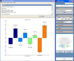
Cell
means of a single ANOVA: For the first type,
one is usually interested in
average values of cells (for instance as bar plot) and measures of the
variance in this cell (error bars). To start the plotting module that
allows you to create this kind of plot, choose \graph\cellplot on
the figure displaying the ANOVA results. The window will expand to
include a plotting axes and an additional menubar will open that allows
you to specify the type of effect and the type of plot you wish to
create. You can choose the way the means are displayed (bars, 3dbars or
symbols in customizable size), the type of error bar to be used, the
labeling of the cells, the polartiy (negative or positive up) and the
plotting of the subject values that contribute to the mean in each
cell. On the 'ANOVA-plotting'-menubar, you also have a small
graph of the channel groups used for the current analysis.
To
plot the cell means corresponding a main effect or
interaction, select the components of the desired effect in the
dropdownmenu on the ANOVA-plotting panel and click 'add' to add this
component to the graph. The name of the component will be added to the
axes title, and the cell means will be displayed as bars (default).
Clicking 'remove' removes the selected component from the plot. Please
note that the order in which you add the components to the plot will
determine the grouping of the bars/symbols and their coloring: The
first selected component will always stay the topmost grouping
criterion. All bars/symbols in one cell of this first component will
all have the same color.
|
|
|
 |
|
|
Screenshot of the ANOVA plotting module |